
Adidas Reverse Retro Jerseys Ranked!
 Anaheim Ducks – Jersey porn right here!
 Los Angeles Kings – Colors are so gorgeous. Well done.
 Buffalo Sabres – Colors are on point. If they did the goat head as the main logo, it would be a top 10 jersey of all time IMO. Get rid of “Buffalo” and the gray stripe on the bottom too.
 Colorado Avalanche – Very simple and paying respect to the Nordiques.
 St Louis Blues – An exact reverse retro for them. Well done!
 Edmonton Oilers – The orange pops so well. Very nice without getting crazy.
 Minnesota WIld – Colors are sooooo nice. North Stars logo would have been perfect, but I udnerstand why they cant use it. Dallas should have then.
 Ottawa Senators – So much red and I love it!
 Winnipeg Jets – The bright blue makes this pop just enough. A white version of this would be gorgeous.
 Pittsburgh Penguins – I picture Jagr and his magnificent mullet flying in the blacks of this.
 Arizona Coyotes – I hesitated with this one then looked back and saw they wore green versions. I dont quite understand where the purple came from though.
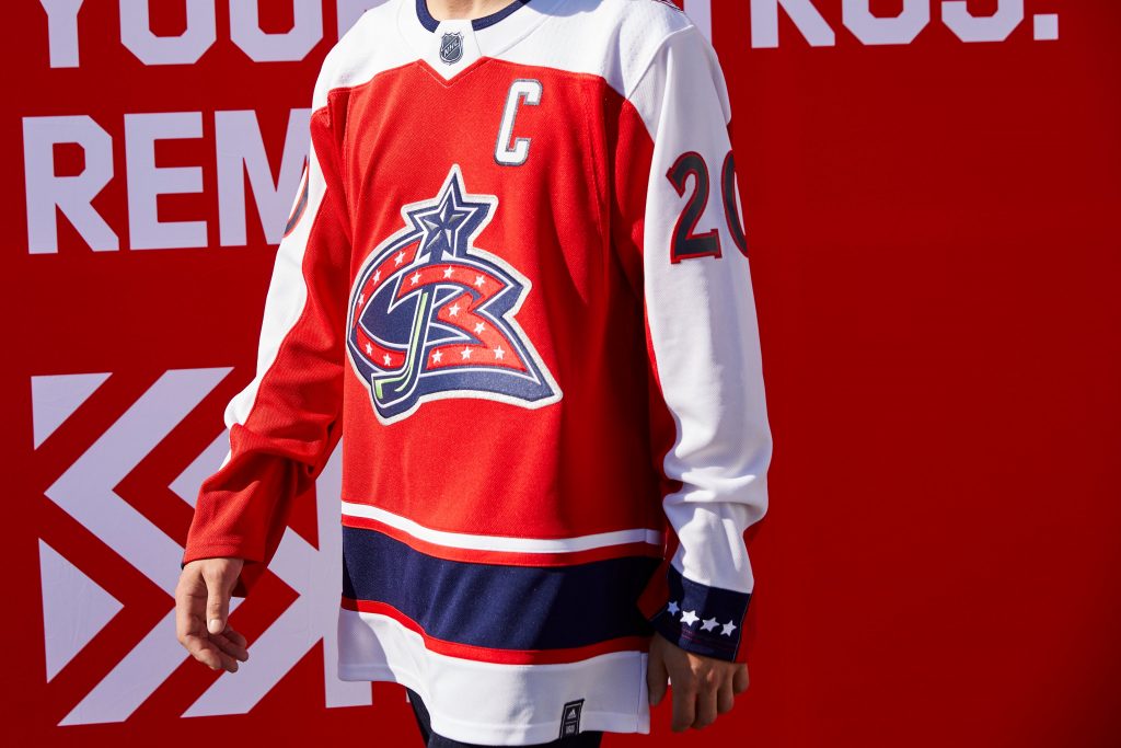 Columbus Blue Jackets – This is actually a beautiful jersey and like the Blues took reverse retro almost literally.
 Philadelphia Flyers – Eric Lindros, John Leclair, and Mikael Renberg is all I see. Scary!
 Carolina Hurricanes – Gray? Why gray? Top 5 jersey of all time and you change it to gray!
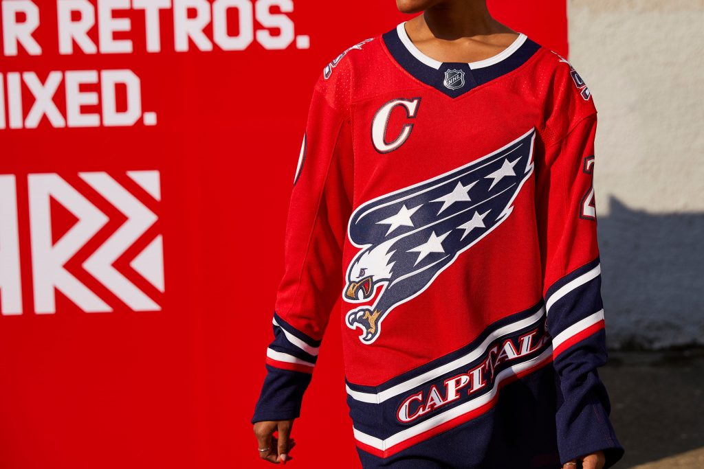 Washington Capitals – I really liked this one. Maybe white on the botto minstead of navy, but a great looking jersey.
 Montreal Canadiens – Another one I really liked. Nothing extreme and great looking.
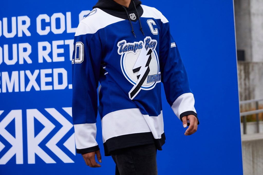 Tampa Bay Lightning – I dont love the Blue main over black, but a missed opportunity not with the bolts and waves.
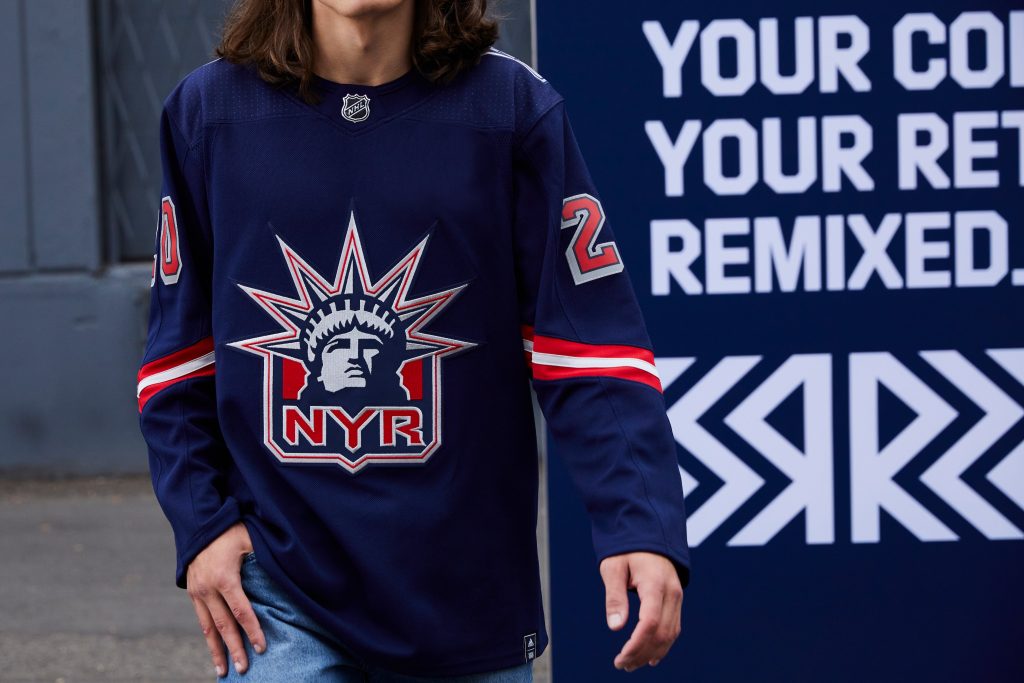 New York Rangers – I wanted to love this, but feel the arms are too simple.
 San Jose Sharks – Not a huge fan of the arms.
 Calgary Flames – Solid throwback to this logo. Nearly identical to the 90s version.
 Boston Bruins – A beautiful jersey. Nothing extreme.
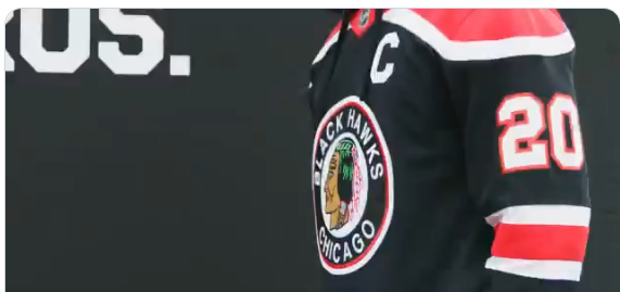 Chicago Blackhawks – Kindof boring, but they’ve been in 94 outdoor games, they’ve used up all creativity.
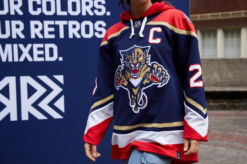 Florida Panthers – Solid overall, but I think I would’ve did red as the main color.
 New Jersey Devils – I thought I’d love the green, but it didnt hit me. The 2014 Stadium Series was perfect with the green pants.
 Vancouver Canucks – Huge missed opportunity not doing the 70’s/80s V. I know they just did the 90s 50th anniversary, but i wouldve preferred those colors at least.
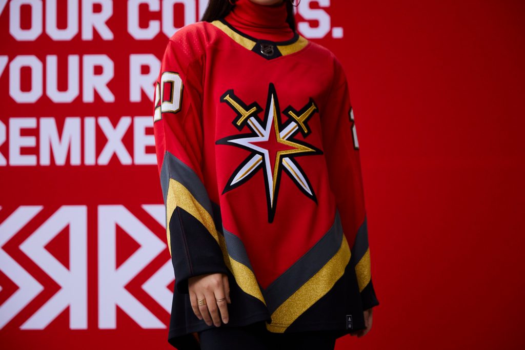 Vegas Golden Knights – I’m hard on them just because they dont have a retro. This is actually a pretty nice jersey.
 Nashville Predators – Another that isn’t much different than their current jersey. Gray shoulders only.
 New York Islanders – I actually had to look up what they changed from their current jersey.
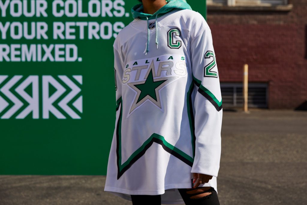 Dallas Stars – Needed to be mainly green and it would have been top 10. This looks like a practice jersey.
 Toronto Maple Leafs – The logo and the gray. So much wrong with this when it should have been so easy.
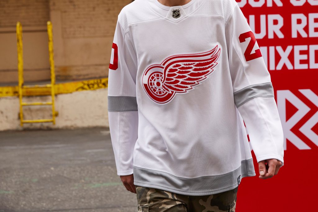 Detroit Red Wings – This is their practice jersey right?


You May Also Like
Dany Heatley

Jaromir Jagr
